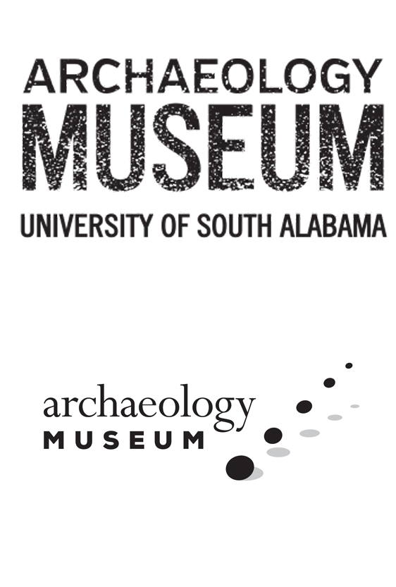
Archaeology Museum Logos
The client needed a logo for the museum and gift shop. Ironically, three months after the logo was chosen, (I had already submitted it for an award), we went back to the drawing board and began creating a new logo. Both have their merit and both were based on the concept that Archaeology affects how we view the past because we are really piecing things together, we do not have a clear picture of the past, decisions we make now, and how they influence how we will live in the future.
The original logo, seen on top, shows the layers of dirt built up on each other and the type distintegrates more as you move down deeper into the earth, which is a metaphor for what we find below. We know less and less about it because of all the time that has passed.
The final logo, seen below, shows circles going back in space, which are meant to represent both the present, past, and future.
You can see the final logo on the Pull-up Banners created for the museum on this page.
The logo on the top won a national design award: Graphic Design USA: 2014 American InHouse Design Awards. The competition received over 4,500 entries and only 15% received awards.

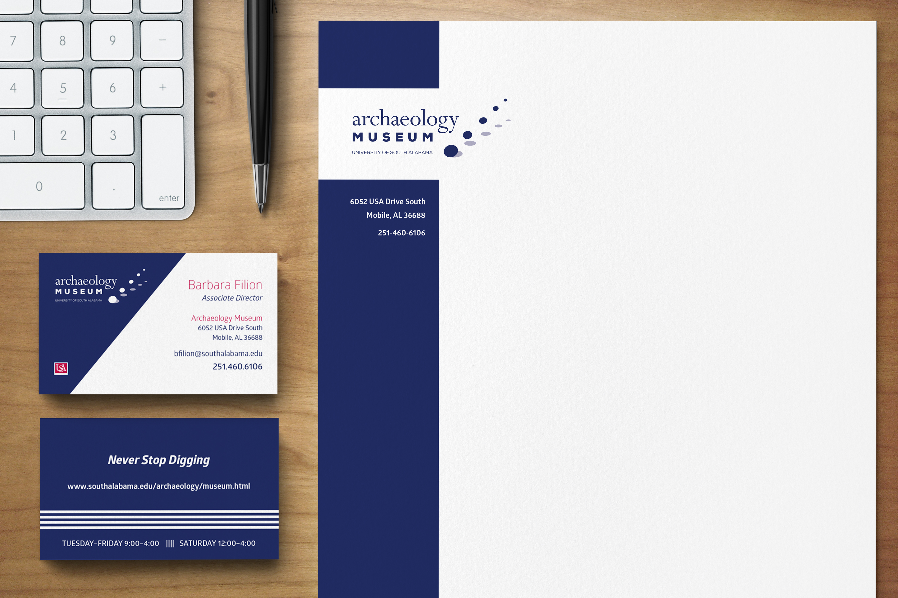
We went with a slightly darker version of the University of South Alabama colors for our palette. We used more of a navy instead of the royal blue.
This is a part of the stationery set created. The business envelope and a template for workbooks was created for the Museum.
We went with a slightly darker version of the University of South Alabama colors for our palette. We used more of a navy instead of the royal blue.


